Visual Analytics

What it is, why it matters, and best practices. This guide provides examples and practical advice to help you perform world-class visual analytics of your own.

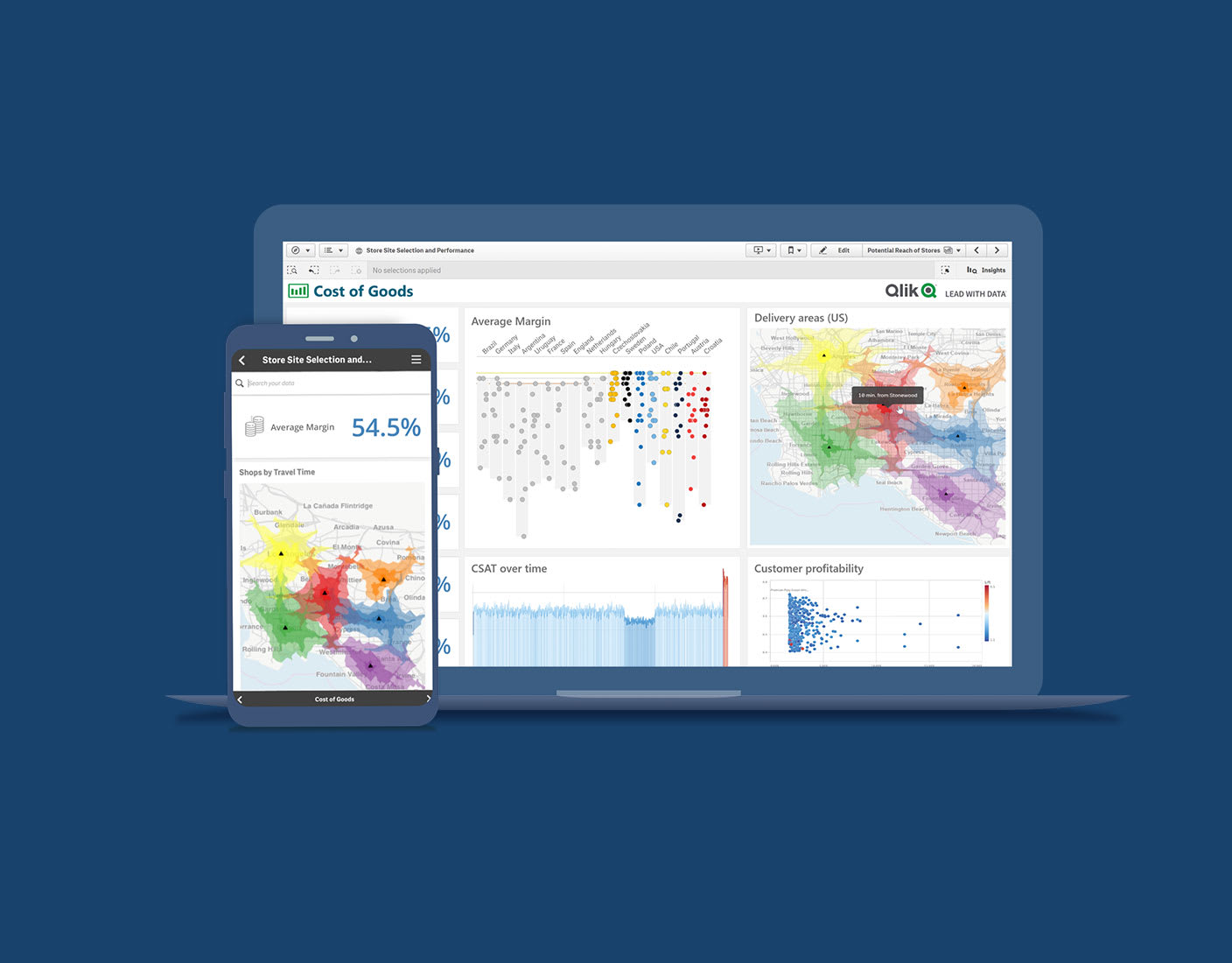
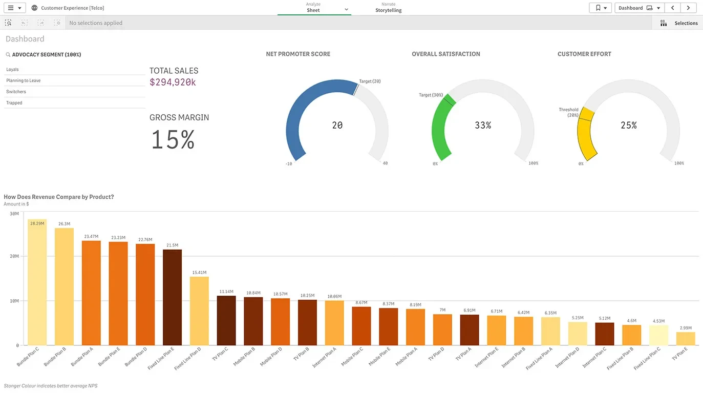
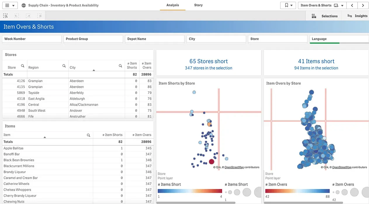
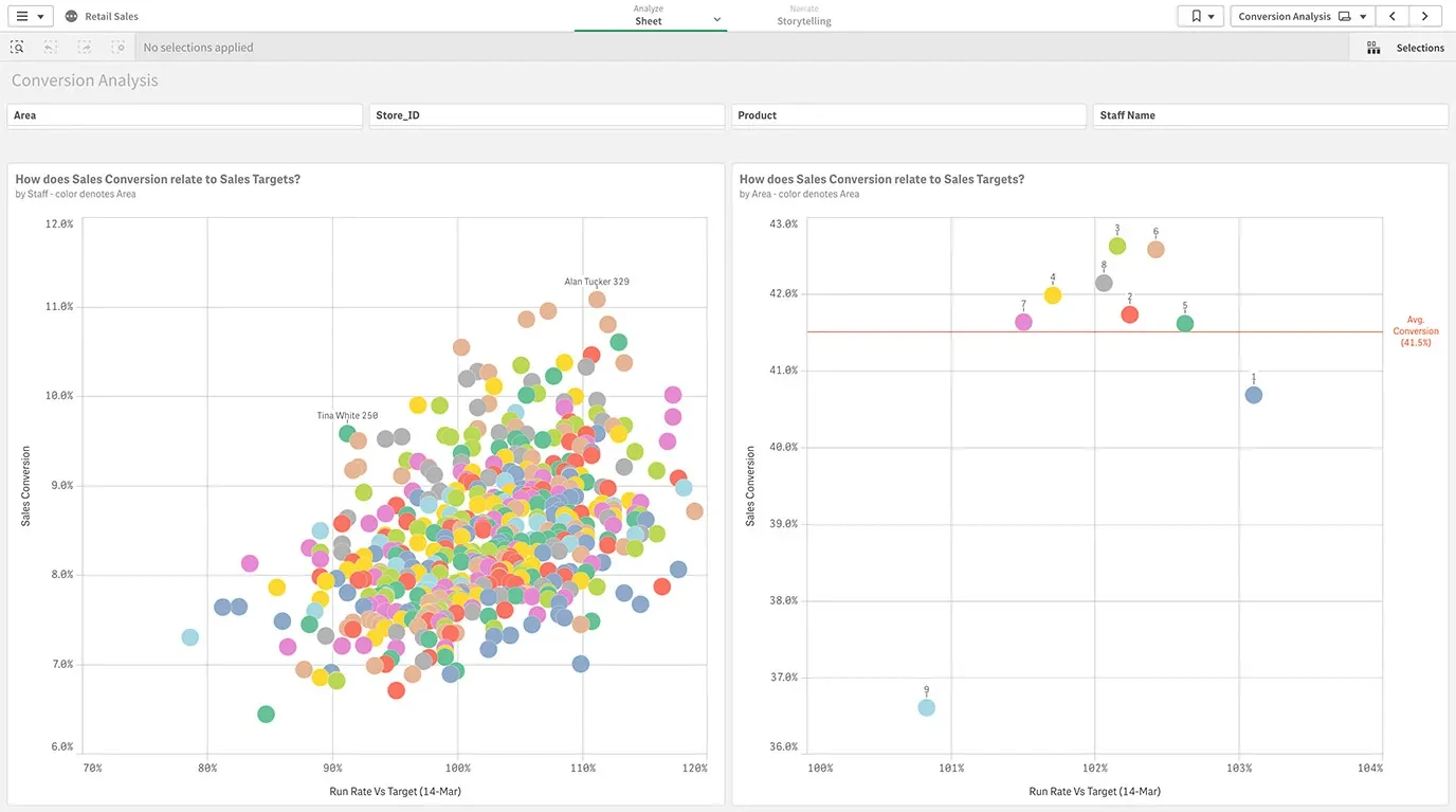
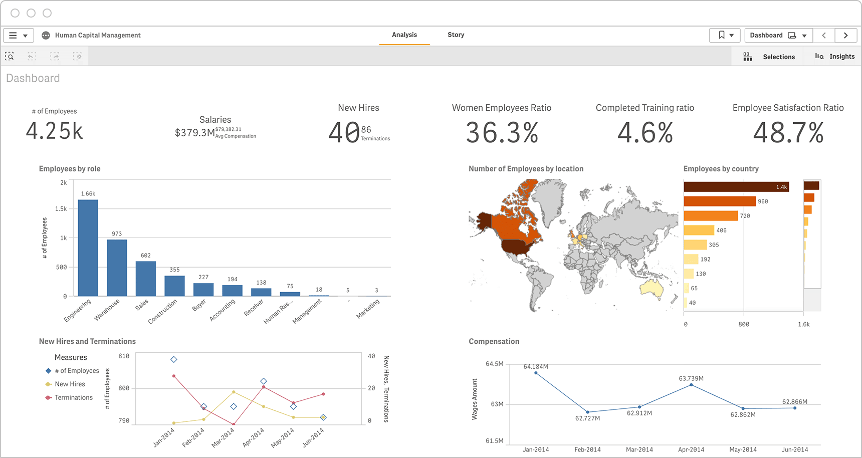
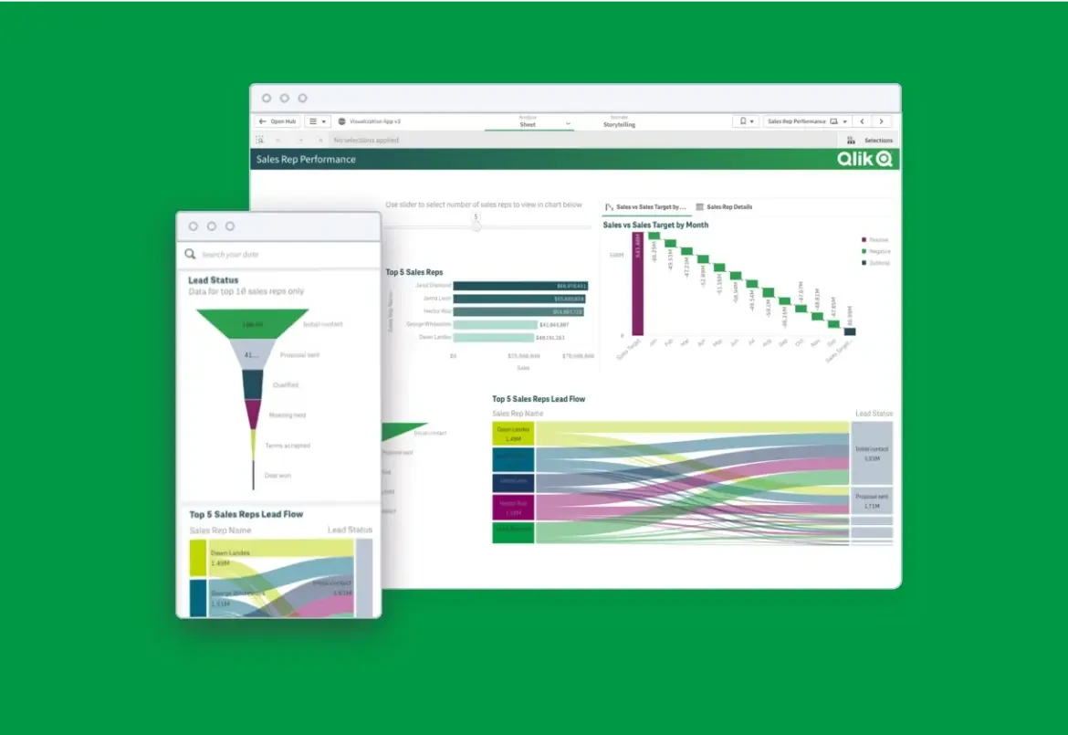
Screenshots demonstrating a rich Qlik Sense dashboard on both desktop and mobile devices.

What is Visual Analytics?

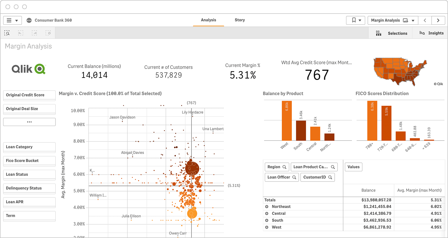
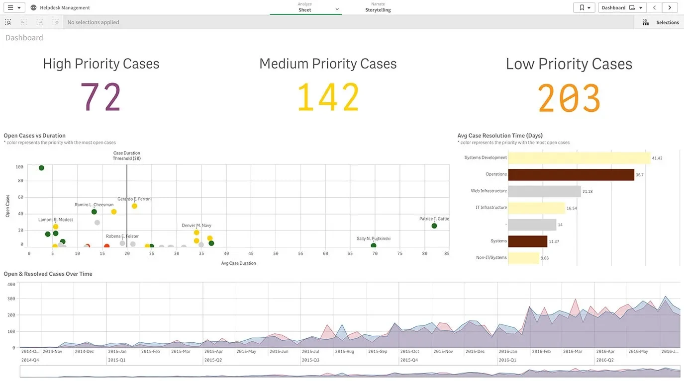
Visual analytics is the use of sophisticated tools and processes to analyze datasets using visual representations of the data. Visualizing the data in graphs, charts, and maps helps users identify patterns and thereby develop actionable insights. These insights help organizations make better, data-driven decisions.

Visual Analytics Benefits

Sometimes confused with data visualization, visual analytics isn’t simply a matter of representing data graphically. Modern, interactive visual analytics makes it easy to combine data from multiple sources and deeply analyze the data directly within the visualization itself. Plus, AI and machine learning algorithms can offer recommendations to help guide your exploration. Ultimately, visual analytics helps you turn massive data sets into business insights which can have a major positive impact on your organization.

Visualization source: Hospital Readmissions
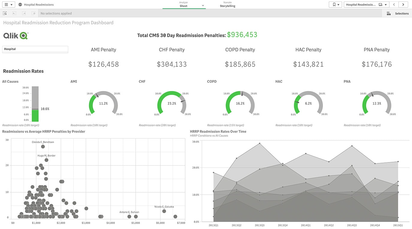
A Qlik Sense dashboard displaying hospital readmission penalties and rates. Includes a total penalty of $936,453 with breakdowns for AMI, CHF, COPD, HAC, and PNA penalties. Graphs show readmission rates and penalty trends.

  1. Share findings and track progress: Interactive reports and dashboards help users track, organize and share key performance indicators  across an organization.

  2. Make faster decisions: Users can understand data insights much more quickly by seeing and working with data sets when they are in a visual format.

  3. Explore data more easily: Self-service analytics tools which allow users to interact with data in a visual context allows them to discover hidden relationships and patterns in the data without relying on help from IT.

  4. Promote data literacy: Making data easier to work with and understand democratizes data analytics, getting more people across and organization involved.

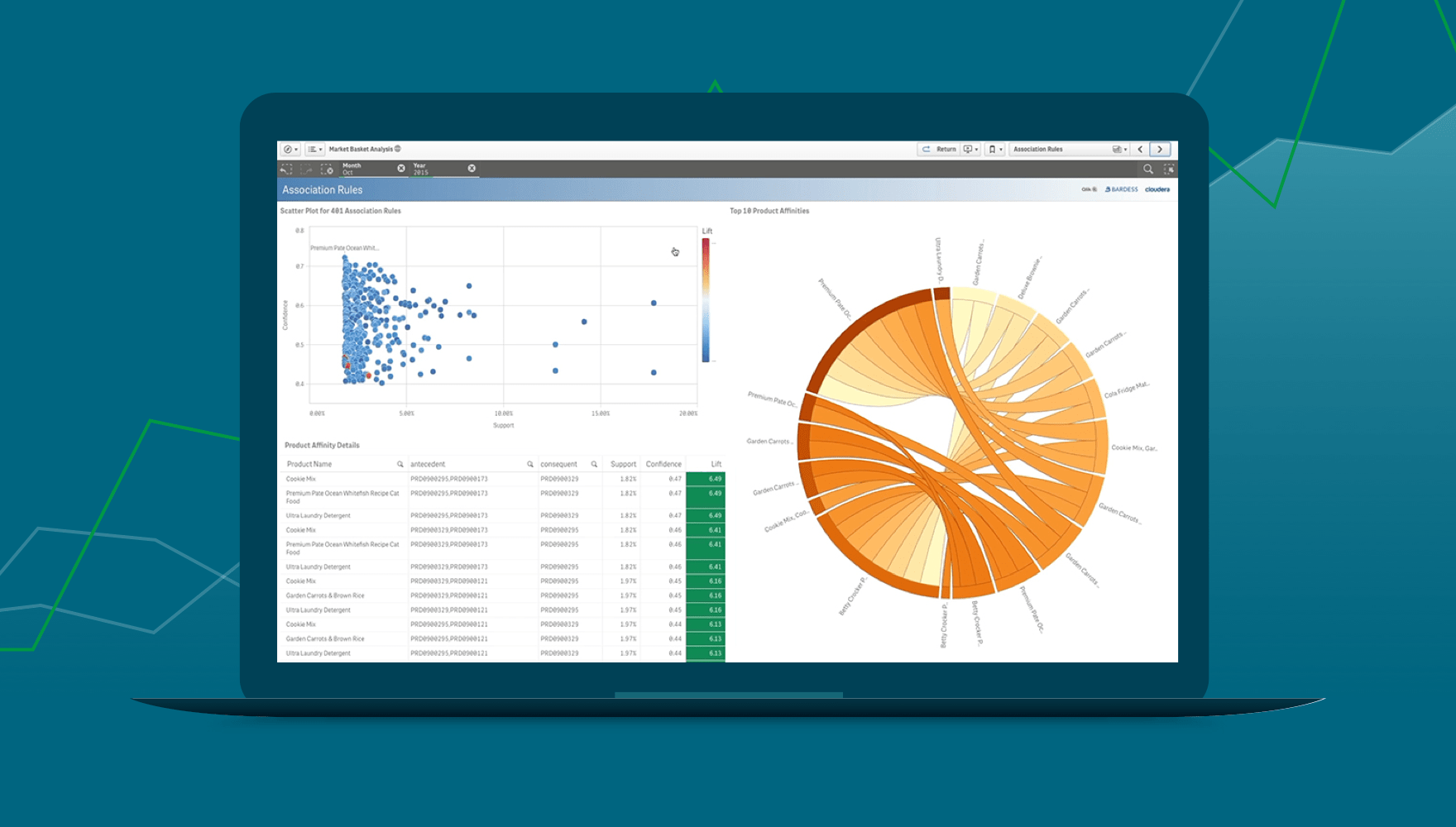
A laptop screen displays a data visualization dashboard with a scatter plot, a chord diagram, and a data table on a teal background with subtle geometric shapes.

10 Ways to Take Your Visualizations to the Next Level

Inspire action with your data. Learn about the latest visualizations and how to choose the right ones to highlight the most important aspects of your data.

Screens showing dashboards with charts and graphs displaying sales data on the Qlik Sense platform.

Dashboard Demo Videos

See how to explore information and quickly gain insights.

  • Combine data from all your sources

  • Dig into visualizations and dashboards

  • Get AI-generated insights

Visual Analytics Best Practices

To help you be successful with visual analytics, we’ve compiled the following key best practices to be aware of.

Define Goals: Before you begin, be sure to define specific goals for your visual data analysis work. What specific questions are you trying to answer?

Integrate and Manage the Data: Your source data needs to be transformed into clean, business-ready information. You’ll need to combine and replicate data from a variety of sources and then bring it into standardized formats stored in a repository such as a data lake or data warehouse.

Simplify Visualizations: Choose the right visual technique to present your story in the simplest way possible. Learn more about visualizing data.

Get Inspired: See the ten most compelling and interesting data visualization examples from recent years.

Blue graphic with upward arrows and the text "The BI & Analytics Survey 23".

BARC’s BI & Analytics Survey 23: Qlik Highlights

In BARC’s survey of real BI users, Qlik Sense ranked #1 in critical KPIs including Performance Satisfaction, Dashboards, and Project Length in its peer groups.

Visual Analytics Software Capabilities

With so many vendors offering visualization features as part of their software, it can be difficult to select the right tool to meet your needs. The best data analytics tools include the following capabilities:

Number 1

Integrate and manage big data

Number 2

Allow free exploration

Number 3

Suggest visuals with AI

Number 4

Embed everywhere

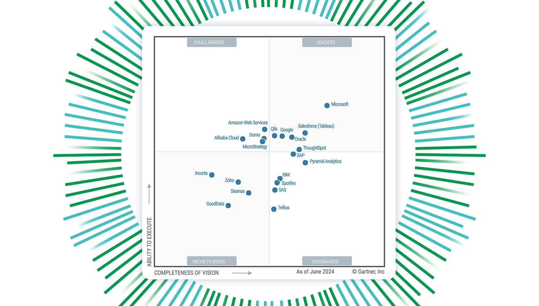
Gartner® Magic Quadrant™ for Analytics and Business Intelligence Platforms grid showing Qlik in the Leader quadrant.

A 14X Magic Quadrant Leader

See why Qlik is recognized again as a Leader in the 2024 Gartner® Magic Quadrant™ for Analytics and Business Intelligence Platforms.

How to Design Best-in-Class Dashboards - Image

How to Design Best-in-Class Dashboards

Download our ebook with 4 must-see dashboard examples.

FAQs

What’s the difference between data visualization and visual analytics?


What are some methods used to visualize data?

Bar charts, line charts, pie charts, cartograms, donut charts, heat maps, histograms, radial maps, streamgraphs, scatter plots, timelines, treemaps, and word clouds are some of the many ways data can be presented visually.


Why is visual analytics important?

It is important because it allows users without data science skills or experience to combine, manipulate, and explore large, dynamic, multi-dimensional, and multi-sourced datasets. In a world in which big data becomes the norm, visual analytics becomes an essential tool.


How do you use visual analytics for business intelligence?

Business users can leverage visual analytics to more easily explore and understand large volumes of diverse data and gather the insights they need to solve problems, identify key opportunities, optimize performance, and inform strategic and tactical decision-making. It can also be used to create interactive dashboards and support collaboration amongst teams working with the same datasets.

See interactive dashboards in action