What it means, best practices, and examples. This guide provides examples and practical advice to help you create best-in-class interactive visualizations of your own.
Interactive data visualization is the use of tools and processes to produce a visual representation of data which can be explored and analyzed directly within the visualization itself. This interaction can help uncover insights which lead to better, data-driven decisions.
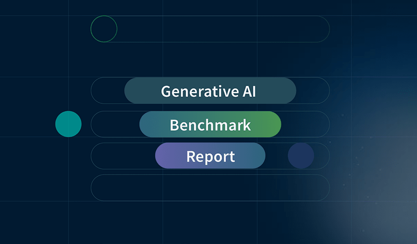
Modern Data Visualization
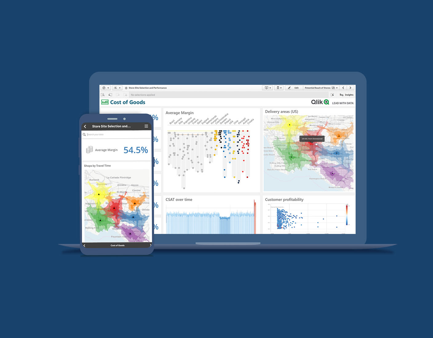
Today’s interactive visualizations and dashboards let you do the following:
Combine data from all your sources
Dig into visualizations and dashboards
Get AI-generated insights
Have a fully functional mobile experience
See how to explore information and quickly gain insights.
10 Ways to Take Your Visualizations to the Next Level
Inspire action with your data. Learn about the latest visualizations and how to choose the right ones to highlight the most important aspects of your data.
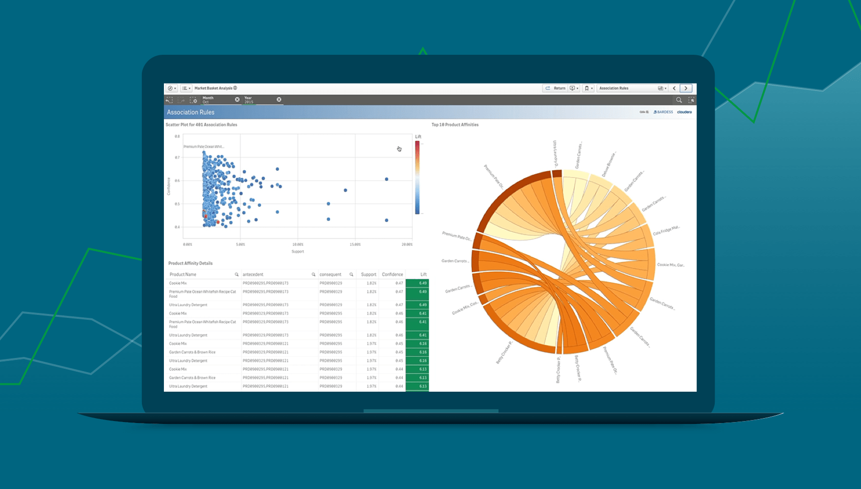
Representing data graphically in the form of graphs, charts, and maps helps users quickly spot trends and assess the status of KPIs. Allowing direct interaction helps users dig deeper to identify patterns and find new relationships in their data.
Ultimately, interactive data visualization helps turn raw data into business insights and value.
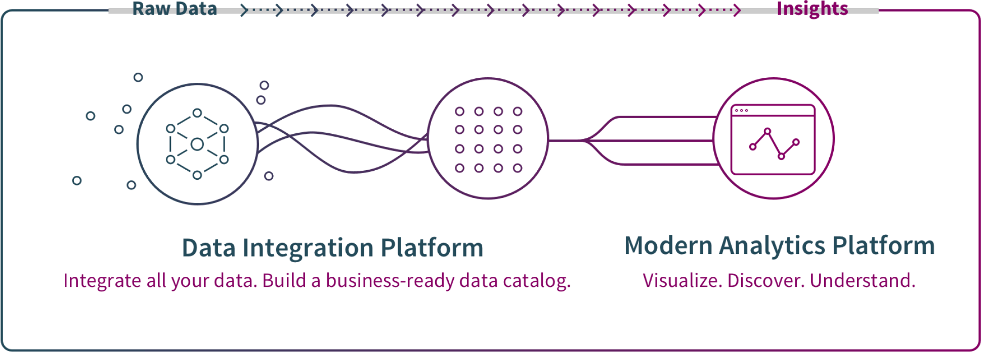
This transformation requires a world class BI tool which provides both a data integration platform and a modern data analytics platform. Once this system is in place, below are three specific benefits that come out.
Make smarter, faster decisions. Interacting with large data sets in a visual format helps users quickly understand the story of their data and develop business insights that lead to data-driven decisions.
Do more analysis and exploration. Interactive visualizations allow and encourage all users to conduct deep analysis without requiring IT support every time they have a new question to explore.
Stay on top of your business.� Simple visualizations in dashboards help users track key performance indicators (KPIs) and metrics. Real-time alerts help users take timely action.
BARC’s BI & Analytics Survey 23: Qlik Highlights
In BARC’s survey of real BI users, Qlik Sense ranked #1 in critical KPIs including Performance Satisfaction, Dashboards, and Project Length in its peer groups.
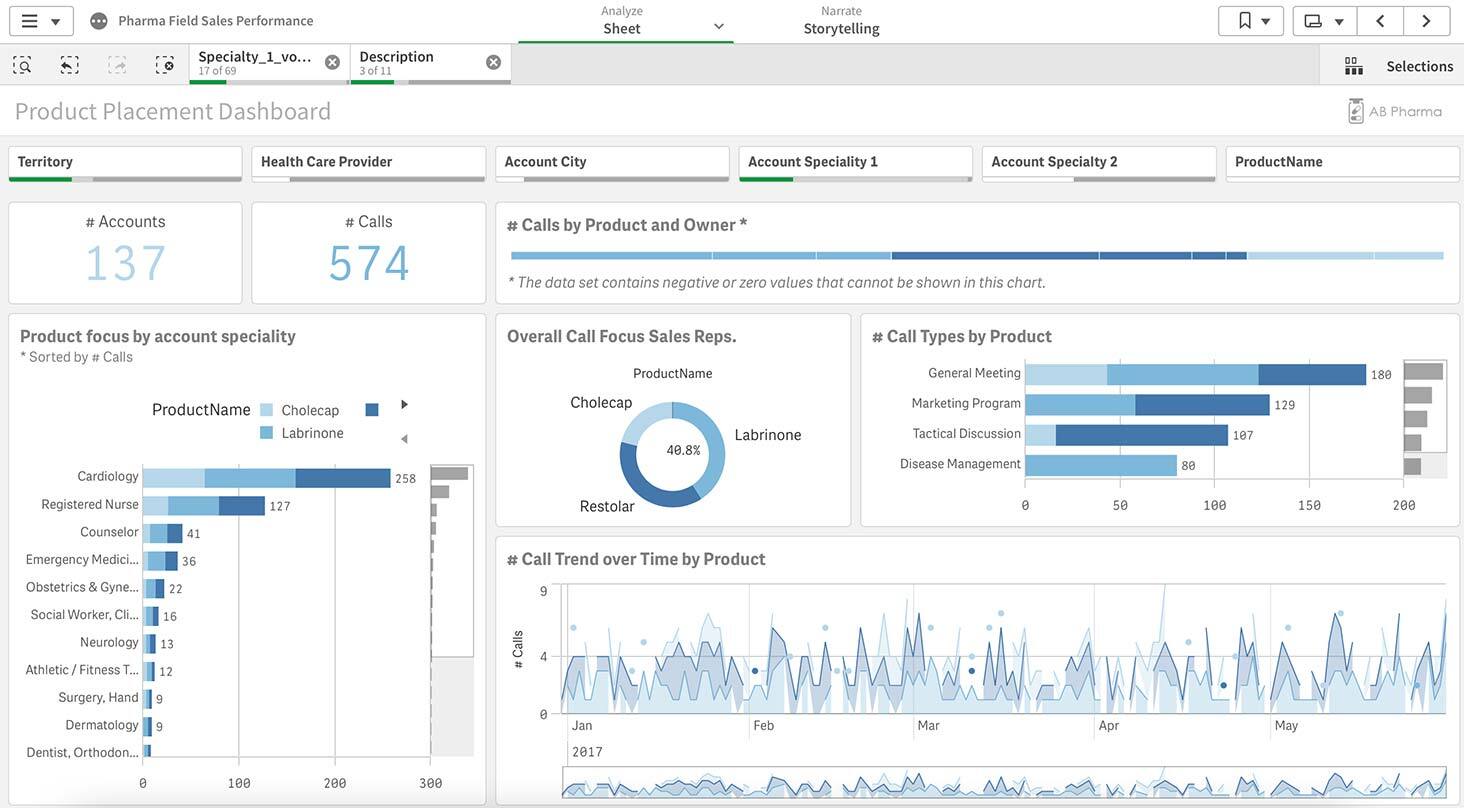
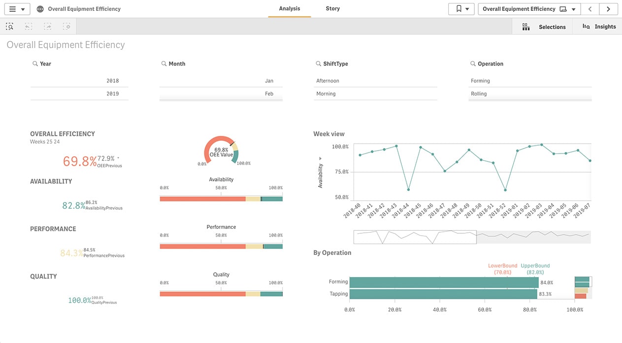
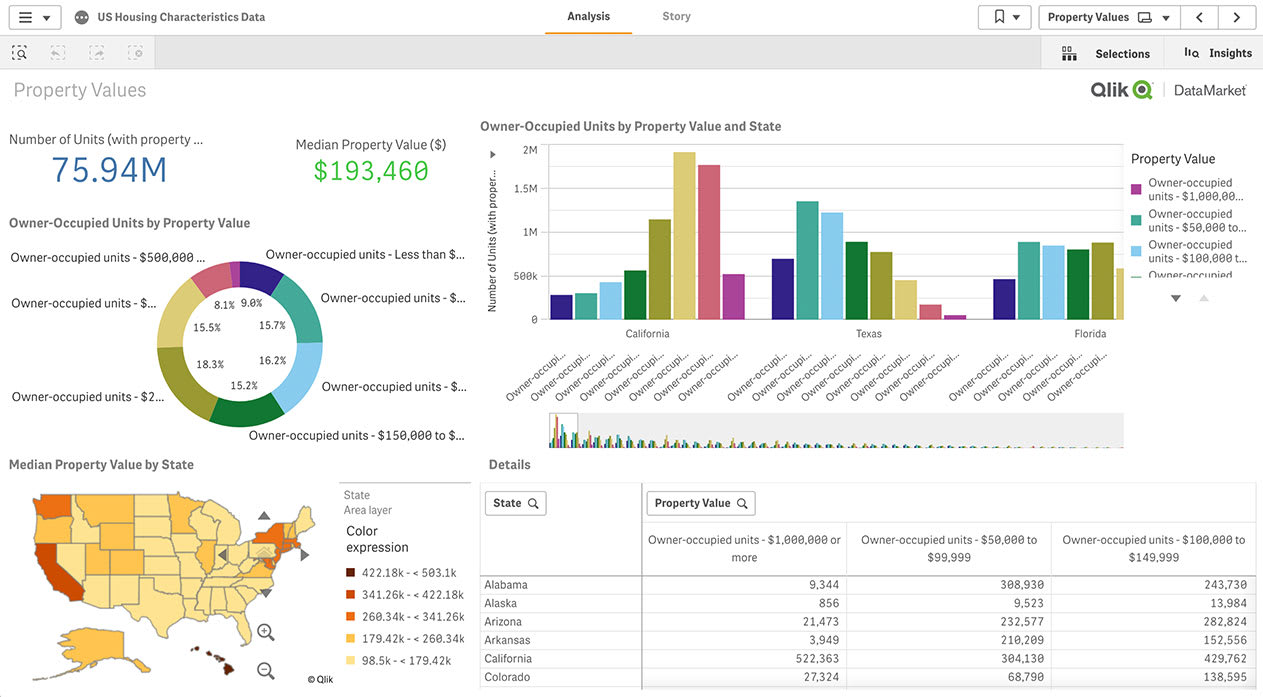
Organizations in every industry and teams in every department leverage interactive data visualization to improve their performance. Below are three examples for specific sectors.
There are four key steps in creating a world-class interactive data visualization.
Data integration. Collect raw data and turn it into clean, analytics-ready information by performing data replication, ingestion and transformation. Then store it in a data lake or data warehouse.
Goal definition. Define the business objective you’re trying to achieve and the data insights you seek. For example, are you trying to optimize a production process or track the ROI of your marketing efforts.
Visualization design. Design begins with selecting KPIs and types of graphs, charts, and maps that best tell your story. Keeping your visualizations clean and simple will help users understand and work with the data.
Collaboration and sharing. Allow all approved users to explore the data freely to uncover their own insights. Your software should allow users to embed your visualizations in other applications and to engage with them on their mobile devices.
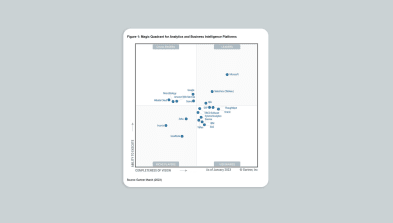
Cheers to 13 years!
Qlik has been named a Leader in the Gartner® Magic Quadrant™ for Analytics and Business Intelligence Platforms for the 13th year in a row.